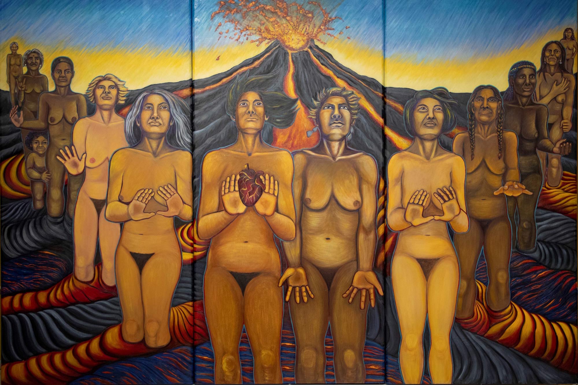
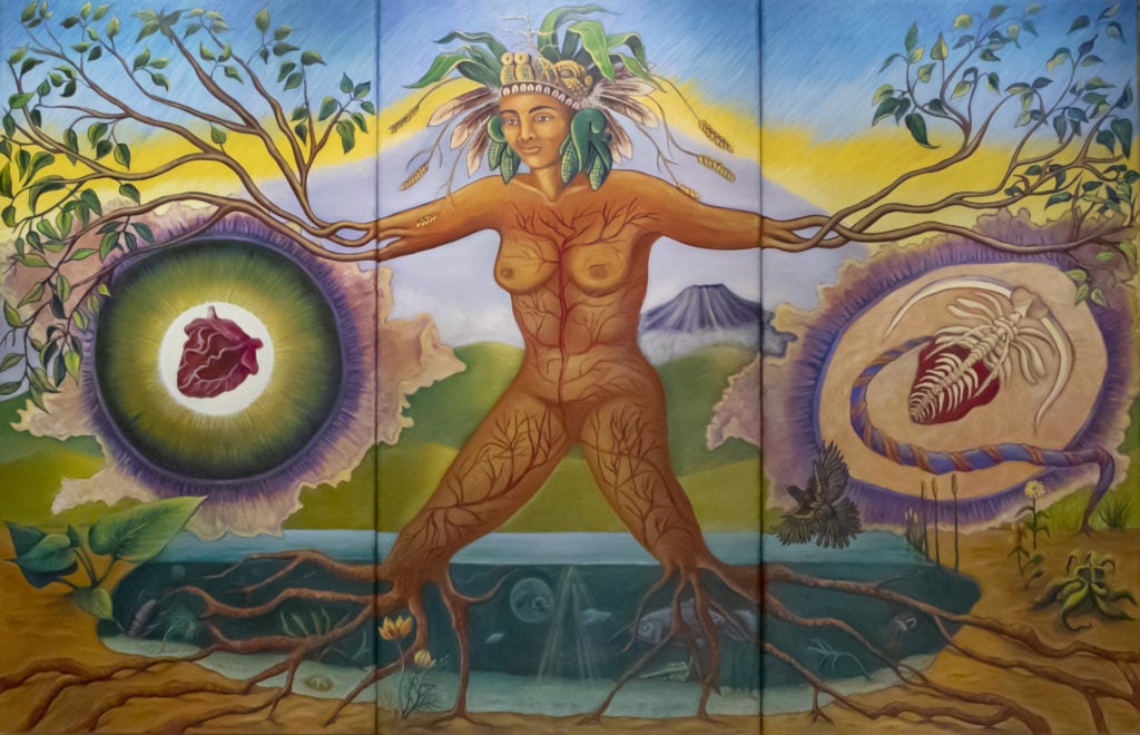
Judith Baca crafted these murals along with 13 other women in Los Angeles. The women depicted in side one are the women that created it. They are shown emerging from the lava, looking up to the goddess inside two while holding a heart to represent fertility. This goddess they are looking up to represents a great deal of life. You can see the branches and roots coming from her limbs and growing into her veins, along with the animals and plants blossoming around her. This notifies the audience that she is basically Mother Earth and she will be respected.
I love these pieces of art because they embody female power and strength. They are a reminder that women are strong and capable, and although women have been treated unequally, they will not be suppressed any longer. Especially during this time, women were fighting for basic equality such as abortion and voting rights, so this was a very symbolic piece of work. The mural is almost like a revolution saying, "You can't keep us down."
The art elements in these pieces are used beautifully. The one that jumps out to me most are lines. The veins inside the goddess' body are differing in thickness and direction, which gives the impression that they are growing inside of the goddess. Lines are used tremendously in side one, showing how the lava seems to push the women out of it, adding to their strength. The colors of both sides are also beautiful. Both sides have the same sky color, showing that the women and goddess are united. The texture is also very essential to these pieces. In both, you can see the sky almost looks like rain is pouring down or the sky is almost falling. The texture and lines on the women's bodies are also beautiful and raw, instead of showing what society says a woman should look like, this artwork shows true beauty in the reality of how women look.
Marina Abramovic
Marina Abramovic is a Serbian-born contemporary artist. She is unique and ruthless in her work. She is actually one of the reasons I wanted to take this class and learn more about art. Rather than painting or creating things with her hands, she does it with her body and actions. She incorporates an audience, and goes to extreme lengths, including death, to make sure her art is understood and leaves a lasting impression.
One of Marina's most famous works is Rhythm Zero, an art performance where the audience could take any of the 72 objects from the table and do whatever they wished to Marina from 8 pm to 2 am. She performed this piece in 1974 in Naples. Her message to the audience was: "I am the object. During this period I take full responsibility." This includes death, rape, and anything else the audience members wanted.
This piece is horrifying, not because of Marina's intent, but because of how the audience reacted. I chose this performance for my blog because it's important to note that the men in the audience cut off Marina's clothing, took naked pictures of her, cut her with knives, held a gun to her head, and did many other painful things by choice. I believe Marina chose to do this performance because she knew what would happen to her at the hands of men, and she wanted to send a message to the world that women are strong.
Although it is not traditional art, Marina uses elements to accompany her performance. The spacing of the items on the table is very inviting. By setting it up in an organized fashion, Marina is telling the audience to choose whatever they like. Gun or feather boa, she is not afraid. The colors of each object, the background, and her clothing are also well thought-out. Most objects are black, her clothing is black, and the space around her is mainly white. I think she chose these more neutral colors to not draw attention to herself or any object in particular. This leaves the audience to decide what they want to do without any preconceived ideas. This being a performance, the artwork is all 3-dimensional and interactive. Form plays an important role in this artwork. Not only is the artist standing right in front of the audience, but she is also inviting them to be part of her art piece. Without them, the piece has little meaning.
Judy Chicago
Judy Chicago is an American artist known for her feminist art. Judy is a pioneer for women's rights and equality. Her work is contemporary and she often collaborates with other female artists. She's known most for her work The Dinner Party, where she has 33 dinner seats that each represent specific women, with 999 women's names engraved on the dinner table. She uses many types of art, like embroidery, weaving, and ceramics. Another of her most famous works is her series Birth Project, which she made to show the process of birth in both beautiful and mystical ways.
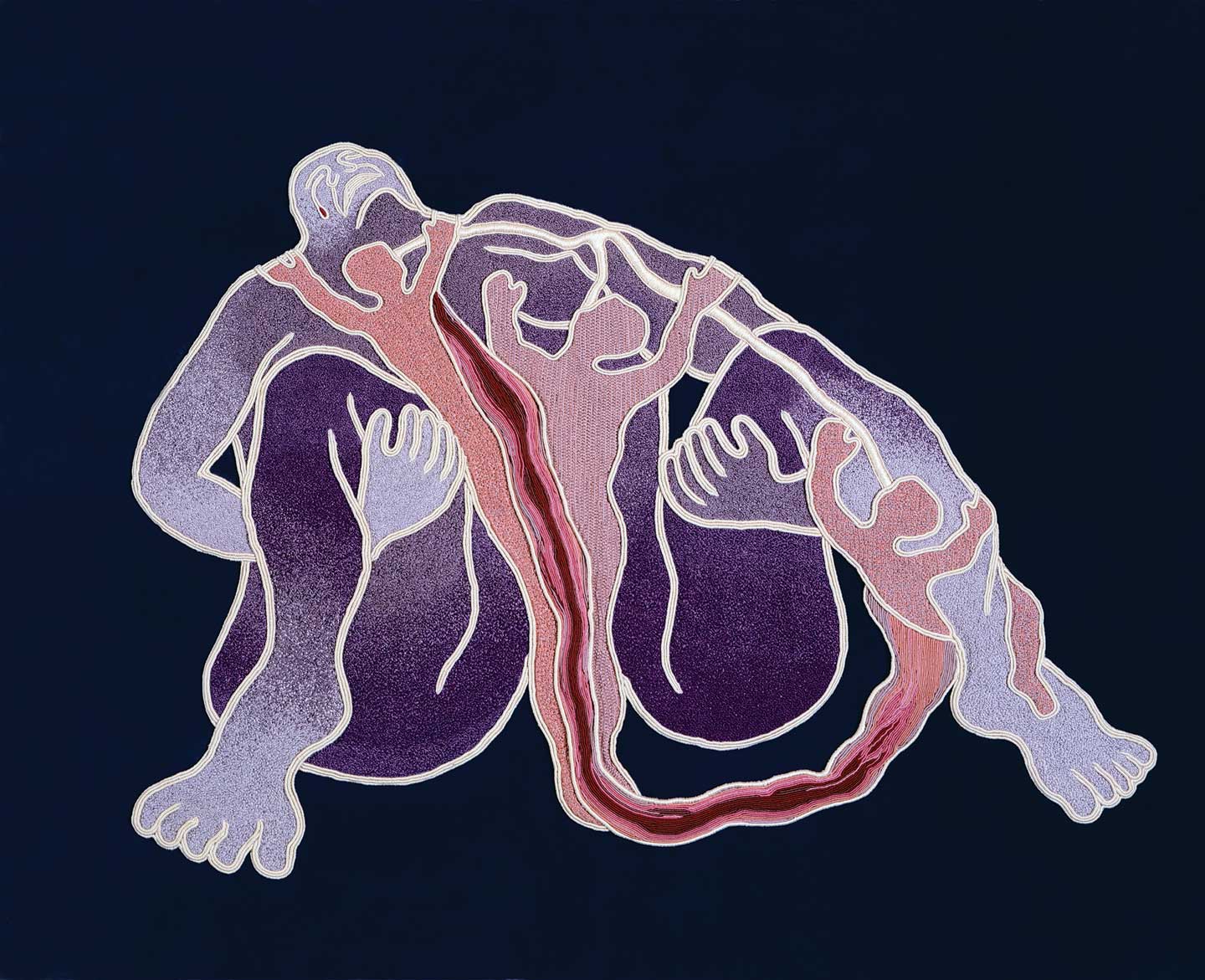
Birth Tear/Tear was made in the United States in 1985 by Judy Chicago for her series Birth Project. Its medium is a macrame over a drawing on fabric.
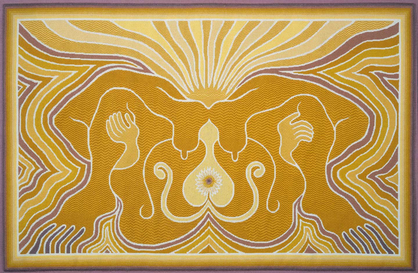
The Crowning: Needlepoint 3 is also part of the Birth Project, made in 1983 in the United States. Its medium is needlepoint over painting on a mesh canvas.
I really like these pieces of art because of how honest and raw they are. Especially during the post-modern era where women's rights were being abused and bodily autonomy was ignored. Women's rights have unfortunately been a controversial topic for a long time and still are today, and Judy is unapologetically unafraid to fight against suppression with her art. She also used her art to send the message to women to embrace being female and love the acts and beauty that come with it. Especially with these series, Judy helps show that women are the foundation of human life.
These two pieces of art both represent an act that only women can perform and one that keeps the human race alive. Both pieces use beautiful colors, lines, and space to portray the intricate process of giving birth in very different ways. Birth Tear/Tear shows a much more painful and emotional version, while The Crowning: Needlepoint 3 shows a beautiful version, with a sunflower to symbolize the place of birth and a sun-like shape radiating above the breasts of the woman's body. The colors are much brighter and more radiant than Birth Tear/Tear, the lines follow each other in harmony and the shape of the body is much more relaxed. All of this indicates a beautiful, lovely process. In Birth Tear/Tear, human shapes seem like they are trying to crawl out of the larger body, and the woman's head is thrown back in what looks like pain. There is also a tear through the middle of the woman's body, highlighted by deep pink and red colors and curving lines.
Martha Rosler
Martha Rosler is an American conceptual artist, who focuses mainly on photography and centers her art around women's point of view. Martha is also very well-known for her work in sculpture, video, installation, and performance. Her collages are known to have multiple meanings, and almost always include a feminist lens.
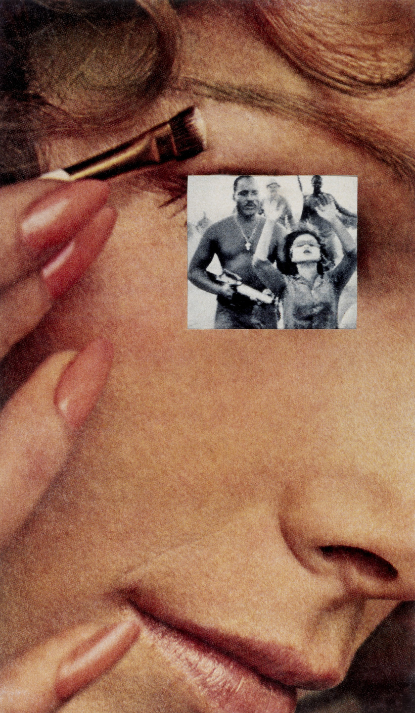
Makeup/Hands Up is a photomontage that was made by Martha from 1967-72 in Brooklyn, New York (although it is a bit before 1980, I feel this piece is very important). This art piece features a woman doing her makeup, her eye covered by a woman being held at gunpoint during the Vietnam War. This shows the complexity of women during this time, while beautifully combining the double-sided lifestyle of women. Not only were women expected to be fully manicured and made up, but they also had to endure rape and abuse while maintaining the image of a "perfect woman."
I really like this artwork, although it shows the harsh reality for women from this time period, it is raw and realistic. The spacing is very interesting. Martha could have chosen to put the smaller image anywhere but deliberately covered the eye. I think by doing this, she's trying to show that underneath the perfectly made-up faces and nails, women are filled with trauma from the war, but continue to make themselves up as if everything is fine. Martha really depicts the true strength of women in this work. The texture is also very interesting; both pictures are rather grainy, and to me, this adds a darker view to the collage. Instead of being clear and in pristine condition, the work is dulled and seems to say it's tired, just like how women are tired of inequities. Lastly, the use of a colored photo with a black and white photo on top adds great contrast to the two photos. This embellishes the duality between war and the cosmopolitan lifestyle.
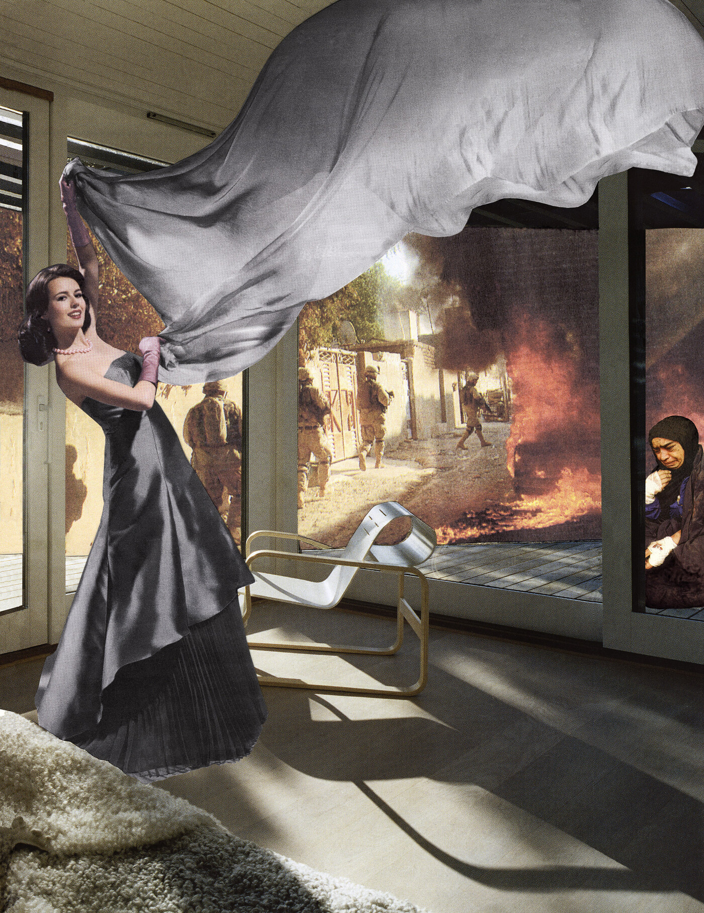
In 2008 in Brooklyn, Martha created The Gray Drape. There are so many elements to this piece of art. A white, polished housewife is covering up a battlefield, and a Vietnamese woman holding her bleeding baby while surrounded by armed men and fire. Martha shows directly that women were expected not only to be the perfect housewives, they were meant to clean up the battlefield and take huge losses, like their children dying. The white woman is covering up the battle while wearing a pristine dress, perfectly done makeup, and a smile on her face. If this doesn't show the duality of women during this era then I don't know what does.
I think Martha uses shapes very well. The collage fits together really well and not only are the shapes of each part done well, but the spacing to me is perfect. You can see each part of the collage that she is trying to feature, as well as see what she was trying to create with the different picture pieces. I also think the color choices are really smart because the gray dress matches the gray drape, which contrasts hugely with the orange flame and black clothing worn by the Vietnamese woman. Each of these elements works together to bring the piece together and show the harsh reality of the war and women's roles during this time.
Sources
“About.” Judy Baca, 5 Apr. 2023, judy baca.
Artnet.Com, the gray drape. Accessed 29 July 2023.
Dambrot, Shana Nys. “Judy Baca Paints History in Living Color .” LA Weekly, 9 Dec. 2021, judy baca.
“Judy Chicago - Birth Tear/Tear.” Turner Carroll Gallery, 28 Jan. 2022, birth tear/tear.
“Martha Rosler. Makeup/Hands up from the Series House Beautiful: Bringing the War Home. c. 1967-72: MOMA.” The Museum of Modern Art, makeup/hands up. Accessed 29 July 2023.
“Martha Rosler: Makeup/Hands up (1967-1972).” Artsy, makeup/hands up. Accessed 29 July 2023.
“The Matriarchal Mural: When God Was Woman (1980-2021).” Judy Baca, 29 June 2023, the matriarchal mural.
Tate. “‘Rhythm 0’, Marina Abramovic, 1974.” Tate, 1 Jan. 1974, rhythm 0.
Wylder, Viki D. Thompson, et al. “I Am My Body: On Judy Chicago’s Birth Project1:” Flash Art, 20 Jan. 2020, i am my body.


Wow! I am not even sure if I can make a comment that is sufficient enough to describe the emotions that the artwork and artists you have chosen for this post have created in me. Marina's piece Rhythm Zero as a survivor of abuse was triggering to read about I could not imagine witnessing it or what she experienced during that performance.
ReplyDeleteThe artwork is both beautiful and terrifying. I love how all of these women artists are using their artwork to send powerful messages out into the world. Would I have any of this art on my wall No but man are they powerful. Thank you for sharing.
Thank you for sharing this. Feminism and Post Modern Art is a subject that I had not a lot of savoir in. Your blog made me realize there is still a lot of progress to do to put these talented artists in the light. Judith Baca's murals portray female power, Marina Abramovic challenges norms with provocative performances, Judy Chicago celebrates women's contributions, and Martha Rosler are all women that have paved the way for females artist and it was interesting to look at their pieces more in-depth. Birth Tear/Tear by Judy Chicago stood out to me. It’s a beautiful and provoking piece.
ReplyDeleteI enjoyed reading your blog! I agree with you that art was dominated by men for a long period of time. Many more styles of art from different perspectives increased during the Post Modern Era. Art by Judith is very "raw". The art involves nudity but its expressed in a way that isn't disturbing, it seems like its trying to express an important message. The pieces by Judy is even twisted, the use of curve lines and contrast of colors are extremely odd.
ReplyDelete